skip to main |
skip to sidebar
fazchoudhury.com
As I mentioned a couple of posts ago, I've been busy trying to build my own website, I've finally managed to get it up and running but there's still a lot of content to add. I've put up some of the art I did for the Horrible Histories Collection, namely the cards that were free gifts with the magazine and I've also put up pretty much all of the Hi-Fi Choice work. Some of it you may have already seen here on the blog but I think there's plenty of other stuff to check out. There's going to be some crossover because the blog gives me an opportunity to comment on the work in more detail than the site does.
If you'd like to take a look at what's up so far then please go to www.fazchoudhury.com
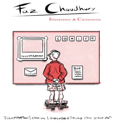
If excitement didn't get the better of you and you're still here, the picture below is the rough sketch of the design that I decided to go with for the front page, I kind of liked the sketchy quality of the rough and was tempted to just go ahead and use it but I decided against it in the end. My plan from the beginning was to use a limited colour scheme and try and go with as much white space as possible. I wanted to keep it try and keep it clean, simple and free of anything too fancy looking.


No comments:
Post a Comment