Tuesday, November 07, 2006
Minor Changes
I've moved the blog over to the new beta of Blogger and made a couple of very small changes to the look of the site. Fortunately the changeover seems to have gone quite well and nothing important appears to be broken or shonky. This bodes well for the future of Blogger, it's about time they updated the service, some nice new features have been included, especially the formatting options. Enough about Blogger, I've been working on some spot illustrations for Horrible Science Magazine but I should be posting some more Elephant stuff soon.
Wednesday, October 04, 2006
The Elephant & Dwat
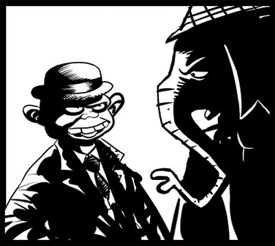
Here's a quick doodle that I did on the computer, I quite like the starkness of it and that there's not much feathering and faffing. I haven't decided on whether to have the Elephant in colour or B & W yet, it may depend on how much solid black is in the final artwork. I'm also undecided on whether to ink traditionally or digitally, on one hand I like the idea of using traditional materials and having original artwork at the end of it but inking digitally can be more freeing when you don't have to worry about art supplies and the mess and have access to that most wonderful feature - the multiple undo. I also find that I can feel more open to experimentation with the marks I make when inking digitally. I may end up with some sort of compromise, I could pencil the pages traditionally and scan them in and ink digitally.
Anyway, this is the Elephant with his companion Dwat, I've used the Dwat character in a comic strip before called The Malice Family. He was a somewhat unsympathetic character and I think I'm veering towards him being a bit more likeable this time around (I stress the "bit"). The Malice Family was semi-autobiographical and the Dwat character was based on somebody very real who happens to be one of those people that are so extreme and often very funny and entertaining when dropped into almost any situation. Or so I hope. In reality he was a never-ending source of entertainment but also a monumental pain in the arse. As I've explained before he's also to blame for the name of this blog.
Anyway, this is the Elephant with his companion Dwat, I've used the Dwat character in a comic strip before called The Malice Family. He was a somewhat unsympathetic character and I think I'm veering towards him being a bit more likeable this time around (I stress the "bit"). The Malice Family was semi-autobiographical and the Dwat character was based on somebody very real who happens to be one of those people that are so extreme and often very funny and entertaining when dropped into almost any situation. Or so I hope. In reality he was a never-ending source of entertainment but also a monumental pain in the arse. As I've explained before he's also to blame for the name of this blog.

Tuesday, October 03, 2006
The Elephant - In Colour
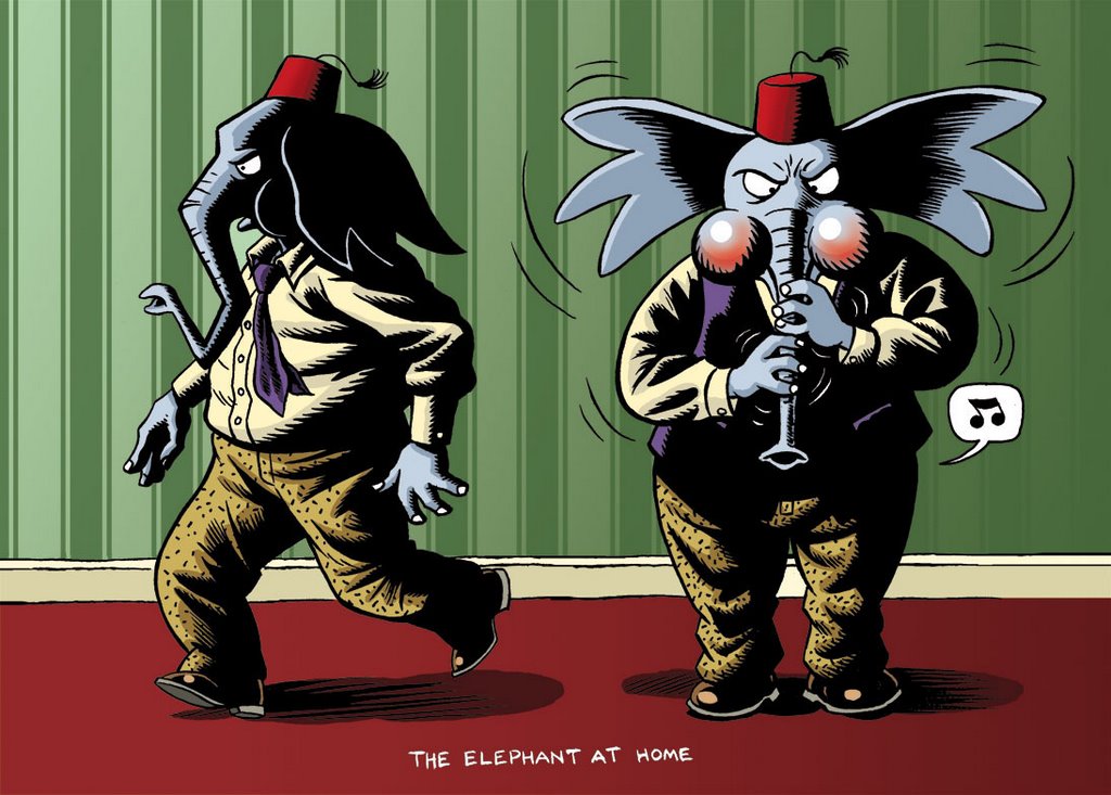
The Elephant
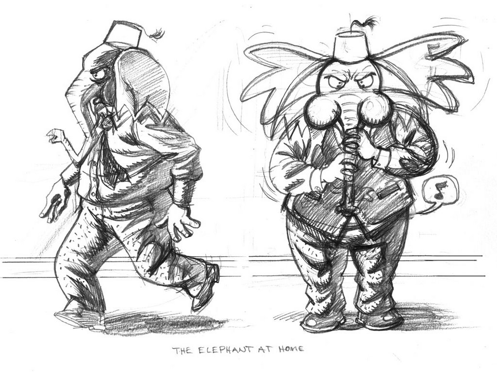
Here's a couple of recent pencil drawings for a character that I came up with some time ago, I've always wanted to draw a comic strip with this character ever since I came up with a name for him (which I'm not going to divulge just yet) but I wasn't entirely sure of what I wanted him to be. Initially the strip was going to be a super-hero parody type of thing (if I can find the very first drawing I'll post it) but I wasn't completely happy with that and at one point I was planning on doing some sort of kids book thing with him and then I ended up completely second-guessing myself into inaction. Since then he's been lurking somewhere at the back of my cobwebbed mind, slowly taking shape, so I've decided to try and flesh him out in a more concerted fashion and actually do something with him in the near future. If I make some public proclamations I may actually feel like I ought to live up to them and produce some more comics.

Monday, October 02, 2006
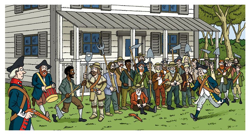
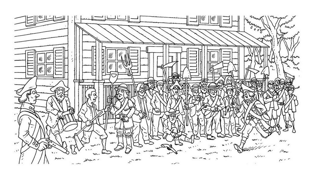
Militiamen Gathering - Part 4
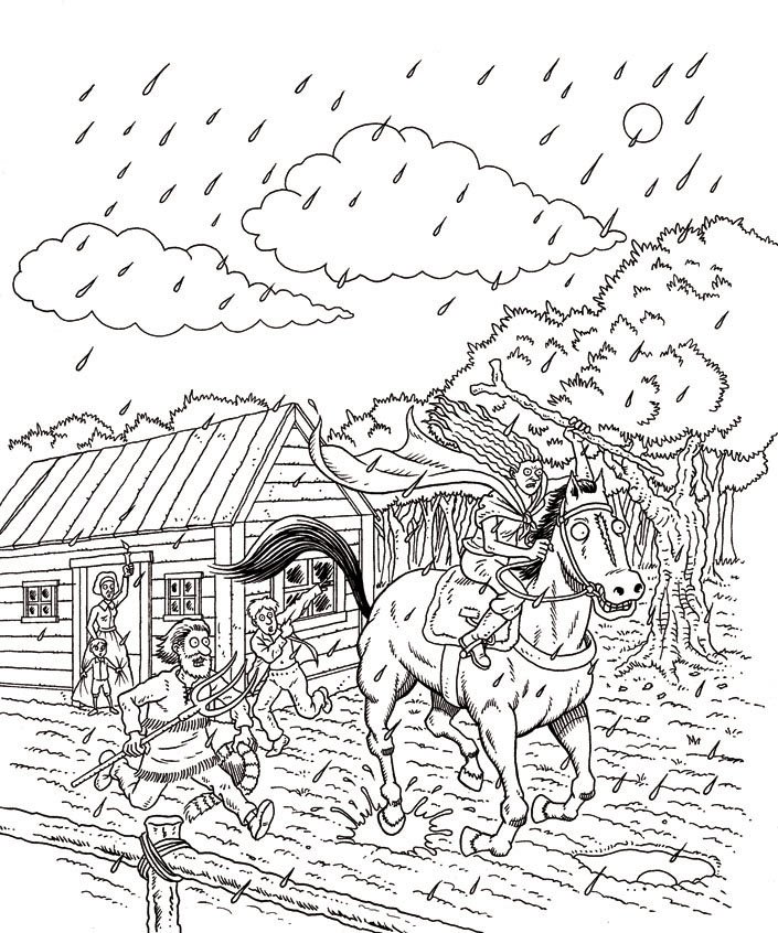
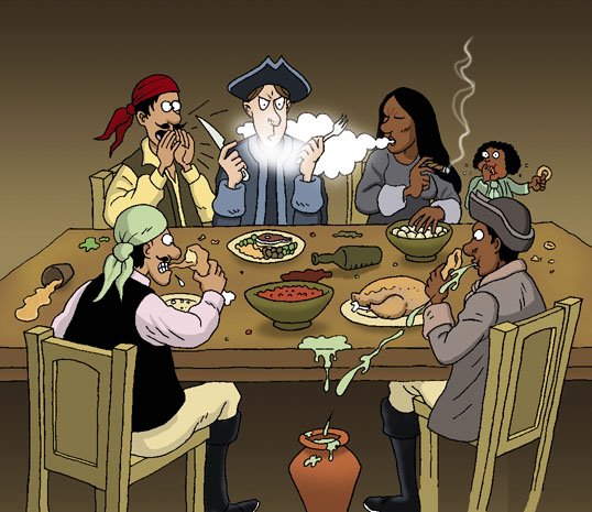
Here's the final all coloured up (I kept within the lines and everything). This was for a client in the US, the publication is produced for schoolchildren and I was asked not to include too many pitchforks for fear of satanic connotations which seemed a little extreme to a Brit like me - bit of a shame as pitchforks do appear to be a more useful and deadly weapon than a spade or hoe.
Not that I'm an expert on such matters.

Not that I'm an expert on such matters.
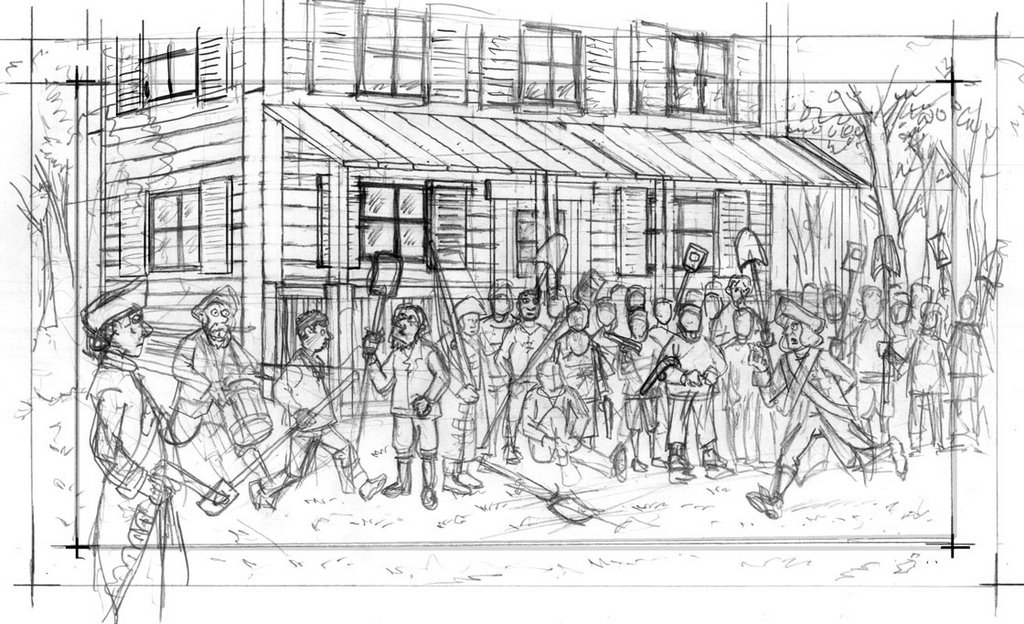
Militiamen Gathering - Part 2
The house I used for reference was a bit too grand so I had to change it to something more modest. Here's the pencils at a stage or two further on.

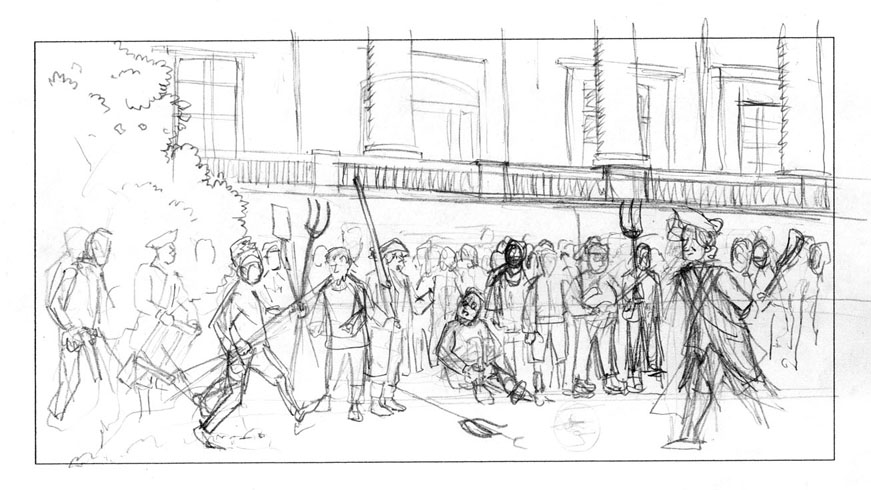
Militiamen Gathering - Part 1
The second illustration I had to do for this recent job was of the militiamen, that Sybil had been rounding up, gathering outside her father's house, her father being Colonel Henry Ludington. This is the very first compositional sketch of the gathering that I did, it's very rough but it was just to see if I was on the right track.

Wednesday, September 27, 2006
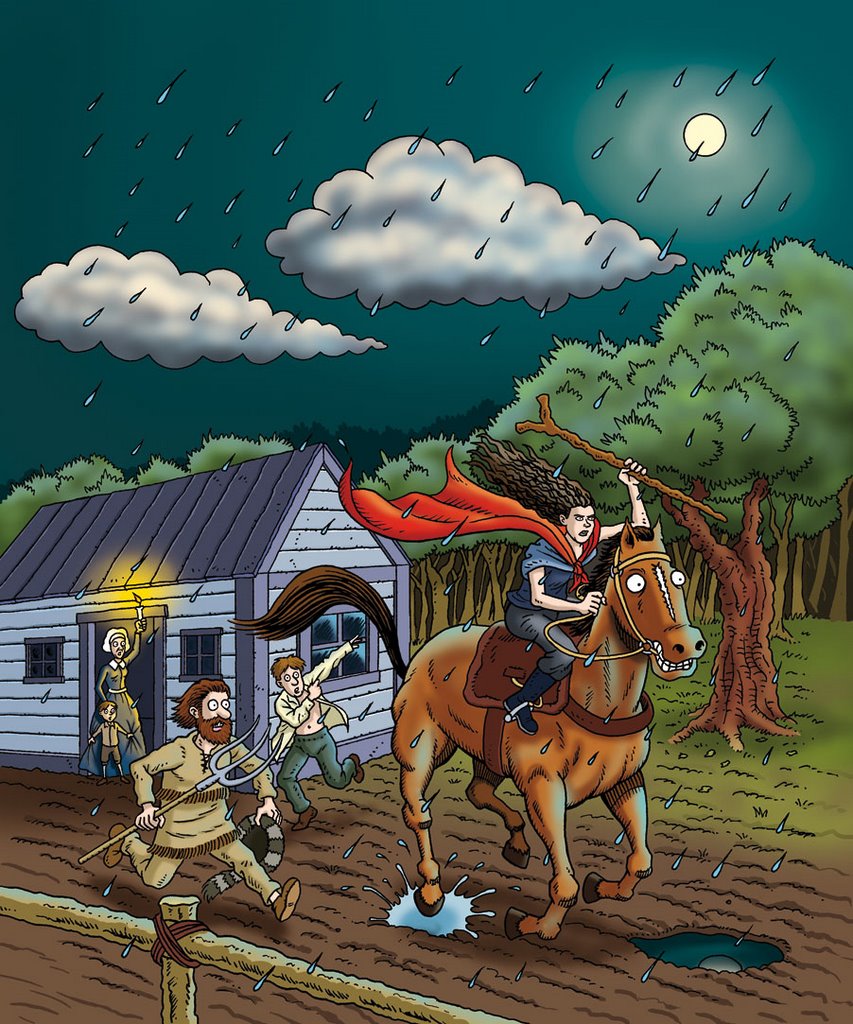
Sybil - Part 4
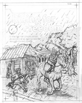
Here's the final version of the illustration, I'm reasonably pleased with how the horse came out as horses can be difficult to get right, they're quite tricksy things to draw. Sybil's face has been softened and made more feminine compared to the inked version posted previously, the client wanted her to look feminine and determined and the previous drawings didn't exactly show that, the scene was also meant to have a "sense of urgency" and I hope I pulled it off for the final artwork.
This is one of three illustrations that were commissioned along with some scrolls for text to be placed on - this was for a full page, one of them was just a very small spot illustration of Sybil on her horse and the other was about a third of a page and shows the gathering of the militiamen which I'll probably be posting something on next.

This is one of three illustrations that were commissioned along with some scrolls for text to be placed on - this was for a full page, one of them was just a very small spot illustration of Sybil on her horse and the other was about a third of a page and shows the gathering of the militiamen which I'll probably be posting something on next.
Monday, September 25, 2006
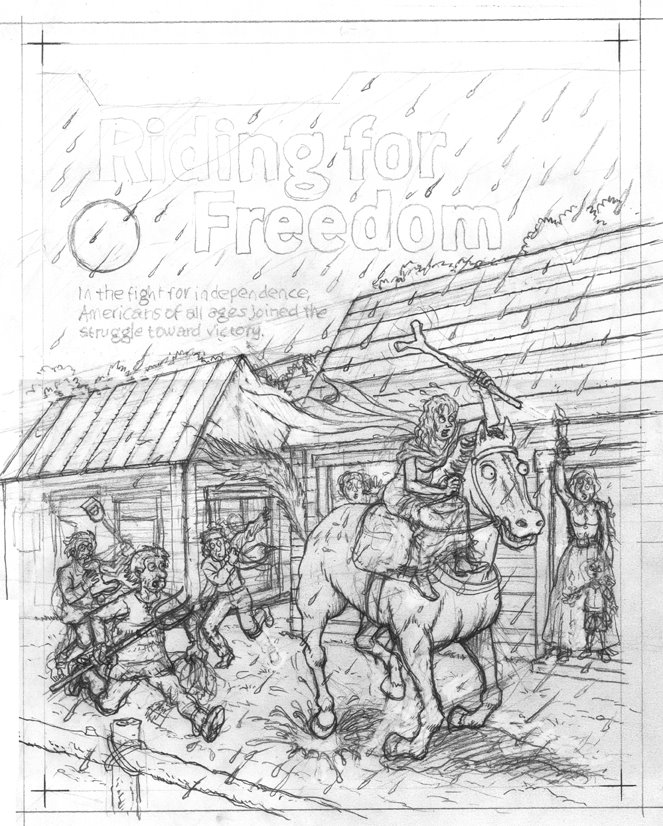
Sybil - Part 3
Here's the inks, all done with Pilot DR fibre-tip pens mostly using a 0.1 size pen with a bit of 0.3. Some cleaning up to be done at this point still, but it's pretty much finished. There was some back and forth with the client on a few elements at this stage, mainly Sybil's face, which went through a few changes over the course of the illustration. You'll be able to see the difference in the finished illustration which I'll be uploading soon.

Wednesday, September 13, 2006
Sybil - Part 2
The client asked for some changes so this is the second version of the rough, I think it looks better for their suggestions, not so claustrophobic and the open space suggests more of a ride for poor old Sybil. There were a couple more minor changes before the final pencils were finished. Go here if you want to read about who Sybil Ludington was and what she did. More soon.

Saturday, September 09, 2006
Sybil Ludington
This is a rough of something I've been working on, the illustration has gone through a few changes since this first rough. I'll post more about this soon.

Monday, July 31, 2006
Friday, June 09, 2006
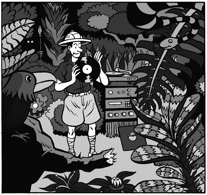
Illustration Friday - Jungle
Haven't posted in a while, I've been a little busy with work lately, here's something I did originally for Hi-Fi Choice, a bit odd what with the stereo in the picture and all but it does fit in with this week's Illustration Friday topic - Jungle.

Friday, April 07, 2006
Spring: Pencils
Initially, the buildings weren't in the picture, then I decided to add them to give more of a sense of space. I'm not sure it was the best idea, I think that they might have over-complicated the picture. What you gain on one hand you lose with the other, it's all a matter of balance.
Thursday, April 06, 2006
Illustration Friday: Spring
It's a good thing that this week's topic for Illustration Friday is Spring, after last week's topic I was in the mood to do something lighter in tone. I've been working on this for too long today to be able to say anything insightful about it, I do know that my eyeballs have dried out so I'm going to have one last cigarette for the day and then I'm off to wonderful, lovely bed. Ahhhh, Laramies...the sweet smell of poison.


Monday, April 03, 2006
Thank You
I decided to have a go at Illustration Friday because I'm not always great at giving myself a brief to work towards and I thought having something sort of imposed on me would be very useful. I didn't really expect anything in the way of feedback considering how many people take part so I was quite surprised to get any comments at all. Thank you to everyone that has stopped by and taken the time to leave comments. You've made it an even more positive experience than I thought it would be.
Now it's time to get cracking on something for the latest topic!
Now it's time to get cracking on something for the latest topic!
Friday, March 31, 2006
Monster - Pencils
These are the pencils for the Monster illustration, I got some Col-Erase light blue pencils for my birthday and decided to try them out. From what I can gather they're pretty much the standard pencil for animators. They're really nice to draw with and I can see why animators love them so. For some reason the shade of blue came out incredibly lurid when I scanned them in so I tweaked them a little to resemble the original a bit more.


Illustration Friday: Monster
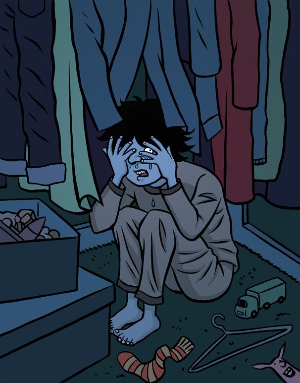
Sorry, but I think the topic has changed to Spring as I was posting to the Illustration Friday site, this was done for the previous topic. I was trying to get this finished before the topic changed and was in a hurry and didn't notice. This is the first Illustration Friday I've taken part in. I was running a bit late because I was working on some typical monster stuff for the illo and then realised I wanted to push myself a little and not do a typical monster (as much fun as that may have been). I figured that the scariest monsters are usually the ones that you can't see and this is what I came up with instead.
Monday, March 27, 2006
Pootling
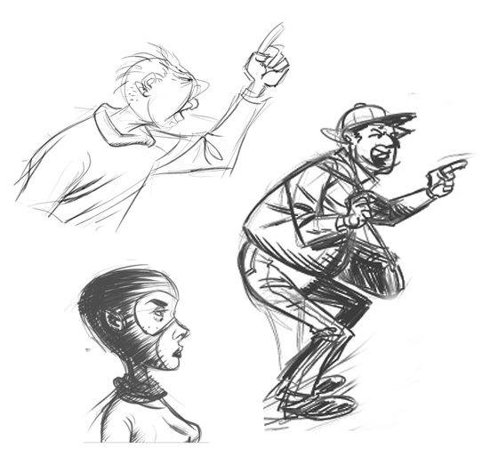
Just some more pootling about on the 'puter. Seems to be some sort of pointing thing going on, dunno what that's about.

Thursday, March 16, 2006
ICA Wallcomic
Tuesday, March 14, 2006
Euros Childs
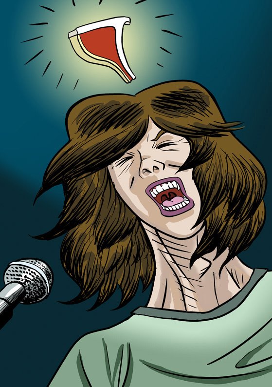
I went with my girlfriend, Sarah, to see Euros Childs live at Bush Hall on Saturday. He's the lead singer and songwriter from Gorky's Zygotic Monkey and has just put out a solo album called "Chops". I was a bit worried about how good it was going to be, the album has a rather DIY sound and doesn't have the richness and warmth of genuine instruments being played, which is one of the things that make Gorky's so good. Thankfully, there was a proper band playing with him that sounded absolutely great and they really made the album shine. Bush Hall is a pretty little venue although the photos on the site don't really indicate quite how small it is. Euros still looks like he's only fourteen years old and he probably always will with his adolescent physique and his teeny, tiny head which is often obscured by his floppy hair. His small head makes his neck look rather large and wide and I figured he was interesting looking enough to try and draw. Not so sure about the chop, I liked the idea of it replacing the old cartoon cliché lightbulb but I ain't so sure it works. The colouring is a bit slapdash but I wanted to keep it fairly fresh and not overwork it. I might have over-exaggerated the amount of hair but it's what stands out most when he's playing live and shaking his head a lot.

Friday, March 10, 2006
Thursday, March 09, 2006
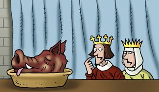
Middle Aged Food
As promised (although a bit later than planned), here's some more of the Middle Ages food spots. I think these came out quite well, they're fairly solid Horrible Histories work and I can look at them without cringing (too much). I tend to prefer working on something more character based than an image that relies on scene-setting very heavily. That's not necessarily an admirable trait but it's definitely where my interests lie. Despite being supplied with some reference for each illustration and usually searching for additional material myself, I always felt it was hard to do justice to the period in the time allotted and that I was drawing with only a minor knowledge of time and place. It probably didn't matter too much as it's all very cartoonish but I like to feel I'm working with a bit more understanding of the material than I usually had whilst working on Horrible History. I confess that despite having drawn all this history based work my knowledge of the subject hasn't improved much if at all.


Monday, March 06, 2006
Website Update
Just a quick post to mention that I've updated www.fazchoudhury.com, I've added the Horrible Histories double-page spreads that I did. More stuff for the blog soon, honest...
Wednesday, March 01, 2006
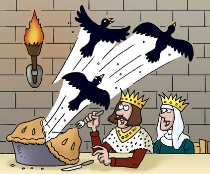
Look out! Jelly coming!
I’ve been working on some illustrations for the Horrible Science magazine and haven’t been posting to the blog of late, I'll try to make up for it. Here’s another Horrible Histories spot illustration, it’s titled Bishop’s Feast but I don’t recall what the story is behind it, a common problem seeing as I've done a fair amount of them. I guess Bishop’s had jelly on some special occasion although I can’t understand why they’d have it without ice-cream! Where’s the fun in that? Is it just me or does this picture seem ever so slightly icky? Something to do with the look on the bishop's face I reckon. Maybe it's not just the jelly he's pleased to see...
This was one of a few spots on food in the Middle Ages, I’ll probably post some more of them soon.
This was one of a few spots on food in the Middle Ages, I’ll probably post some more of them soon.

Thursday, February 16, 2006
fazchoudhury.com
As I mentioned a couple of posts ago, I've been busy trying to build my own website, I've finally managed to get it up and running but there's still a lot of content to add. I've put up some of the art I did for the Horrible Histories Collection, namely the cards that were free gifts with the magazine and I've also put up pretty much all of the Hi-Fi Choice work. Some of it you may have already seen here on the blog but I think there's plenty of other stuff to check out. There's going to be some crossover because the blog gives me an opportunity to comment on the work in more detail than the site does.
If you'd like to take a look at what's up so far then please go to www.fazchoudhury.com
If excitement didn't get the better of you and you're still here, the picture below is the rough sketch of the design that I decided to go with for the front page, I kind of liked the sketchy quality of the rough and was tempted to just go ahead and use it but I decided against it in the end. My plan from the beginning was to use a limited colour scheme and try and go with as much white space as possible. I wanted to keep it try and keep it clean, simple and free of anything too fancy looking.
Thursday, February 09, 2006
Skills
Utilising my newly learned and yet highly honed (Hah!) HTML skills, I've tweaked the blog's template to get rid of that slightly annoying border that was surrounding all the images. This pleases me.
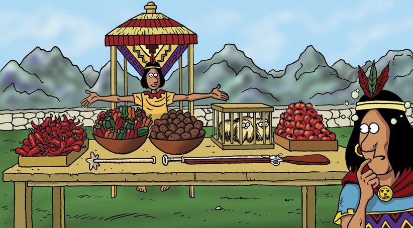
Here's another Horrible History spot illustration, there's probably going to be a whole bunch of these seeing as they've been my primary output for the last few years. This one was done for the puzzle pages. I think it was a spot the odd one out kind of thing and the guy on the right of the picture was meant to be a little drunk and confused as to which item was wrong. I can't remember what the correct answer is but I'd hazard a guess that it's the rifle.

Here's another Horrible History spot illustration, there's probably going to be a whole bunch of these seeing as they've been my primary output for the last few years. This one was done for the puzzle pages. I think it was a spot the odd one out kind of thing and the guy on the right of the picture was meant to be a little drunk and confused as to which item was wrong. I can't remember what the correct answer is but I'd hazard a guess that it's the rifle.
Been busy...
I've been a bit busy trying to build my own website, not knowing anything about how these things are done has made it slow going. Ah well, it's all learning which can't be bad but it can be very frustrating. It's something I've been meaning to do for ages, having an online portfolio and presence is quite important for a commercial artist these days and it's about time I sorted it out. Starting up the blogging again has spurred me on to get cracking with it even if it has made posts to the blog less forthcoming.
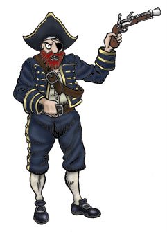
Here's a picture of a pirate, it was a tryout piece for getting work on the Horrible Histories Collection and was the very first thing I did in the Martin Brown style. Martin Brown being the illustrator of nearly all of the Horrible Histories books and the artist who's style had to be emulated by all the artists working on the magazine. The pistol the pirate is holding looks too large and there's all sorts of things about it that seem a bit off but I guess it was okay enough to get me some work in the end. It was my good friend and partner in inky crime, Dave Shelton, that put me in touch with the esteemed Nick Abadzis who was a consultant for Eaglemoss on the Horrible Histories collection, I'd like to say thanks to both of them for without their help I might not have got the opportunity to work on the magazine.

Here's a picture of a pirate, it was a tryout piece for getting work on the Horrible Histories Collection and was the very first thing I did in the Martin Brown style. Martin Brown being the illustrator of nearly all of the Horrible Histories books and the artist who's style had to be emulated by all the artists working on the magazine. The pistol the pirate is holding looks too large and there's all sorts of things about it that seem a bit off but I guess it was okay enough to get me some work in the end. It was my good friend and partner in inky crime, Dave Shelton, that put me in touch with the esteemed Nick Abadzis who was a consultant for Eaglemoss on the Horrible Histories collection, I'd like to say thanks to both of them for without their help I might not have got the opportunity to work on the magazine.
Wednesday, January 25, 2006
Table Manners
This is one of many spot illustrations I did for the Horrible History magazine published by Eaglemoss. I haven't seen it for ages and just came across it whilst browsing through some folders. The title says it all really.

I can hear tiny footsteps in my head
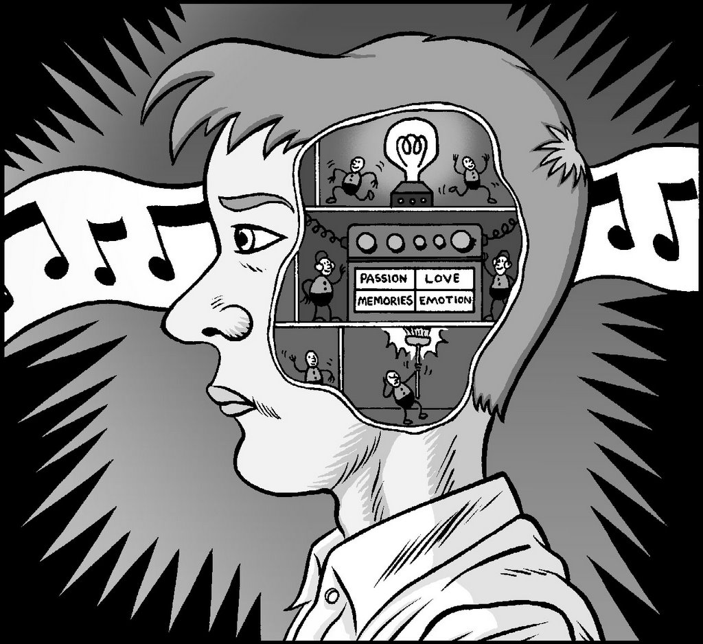
Back again, after a small flurry of activity and a hugely painful, close to incapacitating back pain, which is now on the wane. Hoorah! And...Phew! Didn't fancy having to go and get it "looked" at. Here's another Hi-Fi Choice illustration, I'm guessing it was something to do with sound and emotion but I can't recall exactly what the column was about. All I remember is being asked to have Numskull type characters in it. I don't know if they're still in The Beano but they used to be in it when I were a wee lad.

Tuesday, January 17, 2006
Update
I haven't been able to post anything for a day or two due to a work deadline which is now over, I've also got to finish some work on another project which means I'm going to busy over the next few days too. This means that it'll probably be a short while until I post again, unless I get a few minutes in which to goof around, of course.
Thursday, January 12, 2006
Sons of the Dessert Wine
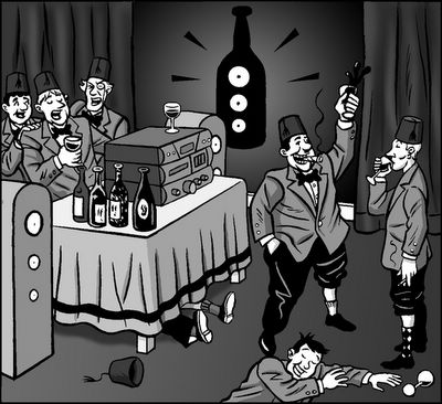
This is another illustration done for Hi-Fi Choice magazine, I tried to make the two guys on the right look a little like Laurel and Hardy out of consideration for the Masonic theme. I think this one was about a wine tasting society that would enjoy fine music with their fine drink. The column I was illustrating in the mag tended to take some real audiophile story or fact and then expand upon it. Not all of the Hi-Fi work was fun to do, having to draw highly uninteresting home stereo kit in most (if not all) of them was usually the worst part. Every now and then I'd have some fun with the rest of the content, this was one of them. Not sure about the smiling bloke on the floor though, he doesn't look quite right, perspective's a bit collywompus. At least it looks like he's having some fun.
Tuesday, January 10, 2006
Why this blog is called What Are You Doing Here?
 Primarily it's a bit of an in-joke amongst friends, it's a phrase that we associate with this guy we used to know (a good few years ago) who would often use it when bumping into you somewhere out and about. It always sounded like he was surprised you were there or as if he was suggesting you oughtn't to be wherever you were, you know...like a pub, a gig, a shop or other such exclusive venues. He would also say it in his Donald Duck on helium voice (which wasn't an affectation, it's how he actually sounds) and it would often be accompanied with a squelchy tap on your shoulder. I shudder even now just thinking about it. Many of us came to dread the shoulder tap. He had an uncanny ability to turn up when you'd least expect it, like the baddest penny there ever was. Nowhere was truly safe. You could try and hide in a cupboard but he'd probably already be in there, waiting...tap, tap!
The same question is also used over and over again in many TV shows, listen out for it, if you've never noticed it you probably will now that it's been pointed out. It's just one of those things that people don't often say in reality (apart from the aforementioned accquaintance) but is ubiquitous on the telly - much like "Let me get this straight..."
Update: Looking back at it this may come across as being a bit mean about the person in question, but I'm not going to change it as it does sum up how things seemed at the time.
Christmas Card
I haven't posted in a very long time but I've decided to see if I can give this blogging lark another go. This is a card I did recently for the company where my girlfriend works. Her boss wanted something to send out to their clients which was also specific to the company. They make facial hair for films and TV, the basic idea was suggested to me and this is what I came up with. This was the first bit of artwork I've produced in quite a while that I could say was in my own style (whatever that may mean). In other words it was an absolute pleasure not to draw in the style of the Horrible History/Science books. I ought to try and do it more often.
Subscribe to:
Posts (Atom)


